39 Designer Secrets to Renovating Tiny Living Spaces
Space is becoming a luxury commodity as property prices rise. Here's everything you need to know if you're renovating small spaces in your property.

Space is becoming a luxury commodity as property prices continue to rise and more apartment buildings sprout in our congested cities.
According to the Australian Bureau of Statistics, the average floor size of a new home and apartment is 183.6 and 124.8 square metres, respectively – the smallest size in over two decades.
Fact: Did you know that globally, the size of Australian homes is second only to American homes (which are 6-8% larger)?
Finding room for all your stuff while pulling off a sophisticated design is the universal struggle of all those who live in small spaces. But it’s a lifestyle choice more and more people are choosing, compelling designers worldwide to invent new ways of balancing style and function to impress even the snootiest guest.
So, we’ve assembled a host of designer secrets to boost your ‘tiny’ renovation project.
We present to you the 39 key design elements to consider when renovating a small space:
- Sneaky Storage Secrets
- Fabulously Functional Furniture
- Climb The Wall
- Light and Colour
- Form Follows Function
Sneaky Storage Secrets
- Take stock of everything you have before renovation; some things will need to go, while some may work well with the new design. You need to be very strict with the amount of space that is available.
- Building storage into every design aspect is the foundation of tiny living spaces. Where you sit, step, and sleep needs intuitive storage that anticipates use and cleverly utilises space.
- Use a door-height storage unit as a room divider; something like a cupboard or bookshelf that faces into both rooms. Stacked crates and open shelving units are also excellent dividers.
- Incorporate electronics into storage, rather than letting them stand alone and take up shelf space – like home theatre components.
- Build drawers into everything.
- Add shelves to the side of cabinets and under the bathroom sink.
- Create hidden storage compartments beneath floorboards.
Fabulously Functional Furniture

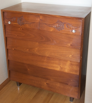
Image from commons.wikimedia by Jeremy van Bedijk
- Resist overstuffing your space with furniture, making your apartment appear smaller.
- Every piece of furniture should be versatile or multi-functional. For example, a coffee table that pulls out into a dining table or a bed that folds into a closet.
- Opt for furnishings that are less blocky and more spindly. Think of open and light frames when picking out tables and chairs.
- Clear furniture made of glass, acrylic or Lucite gives the illusion of more space because, visually, they seem to take up no space at all.
- Choose one perfectly dramatic statement piece, but don’t be tempted to do more. A piece of art, perhaps, or a large rug. A large rug makes a space feel much larger than it is.
- Built-in living room sofas. Top up with customised cushions.
- Floating furniture: floating desks, stairs, and shelves offer an excellent way of clearing floor space.
- Sliding doors instead of hinged. They don’t swing out, which saves space and allows homeowners to organise their furniture closer to the door.
- Install a second-tier rod inside your wardrobe, or move the existing one higher up for more space.
- Smaller tables that double as seating. Avoid big tables, sofas, over-the-top chairs and bed heads that crowd the space.
- Lower seating to add height to the space.
Climb the Wall

Image from Wikimedia
- Vertical space is still space. Whatever can be mounted should be mounted, e.g., lighting, TVs, speakers (or integrated into the ceiling), bikes, shoe/hat racks, coats, bags, cutlery, jewellery, and even a vertical garden.
- Hang your bike on an elegant shelf as a decorative way of saving space. A more straightforward method can be screwing hooks into a beam and hooking the tyres onto them.
- Wooden panelling instead of walls as partitions.
- Go high when using wall space – install storage cabinets and shelving near the ceiling.
- Slatwall panels are flexible shelving units that can be secured to the wall.
- A floating bench shelf installed low along the wall provides extra seating that doesn’t take up floor space.
Light and Colour
- The correct balance of light and colour can create marvellous illusions of space.
- Light colours reflect light and suggest expansion, while darker colours and patterns shrink and absorb.
- Use mirrors to magnify light and space. Place a mirror opposite the window or balcony to bring in the 'outside.'
- Bright and semi-sheer curtains maximise the light.
- Paint the walls white with flashes of colour and textural accents to liven it up. Create a unique touch by adding an accent wall.
- Build custom furniture around windows as a clever way to let the light in.
- All lighting should be fixed on the walls, at least 30 cm below the ceiling. Direct their shine up, down and across the walls to spread light evenly. Desktop lights, sconces and standing lights also achieve this spread and reflection.
Form Follows Function
- Decide what truly matters to you regarding your living space, as your spatial needs form the basis of the floor plan and overall layout. If entertaining and overnight hosting is your primary goal, the design must incorporate sleeping areas, bunk beds, sleeping lofts, couches that pull out, etc.
- Think about the functions of each room and adjust your expectations accordingly. Don’t try to cram four different functions into one room, for example.
- Combine two space concepts into one space, e.g., office space and living room.
- Ceiling:
- Consider adding a sleeping loft and stunning wallpaper if you have high ceilings.
- Hang curtains above the window to add height and air to the room.
- Paint your ceilings in light colours to make them appear higher.
- Sitting areas and reading nooks by the windows utilise space, natural light and beautiful views in one multifunctional swoop. Take advantage by facing furniture towards the windows and balcony so that the exterior space becomes an extension of the interior.
- Save the best views for living and working areas. Install windows at least 20% of the wall for maximum effect.
- Use plants as a way of adding depth and softness to living areas. Position them in corners and around furniture.
- Make the room appear larger by grouping things in threes.
Marie Kondo’s keep-only-what-sparks-joy philosophy ideally informs tiny living spaces, requiring homeowners to stay clean and clutter-free. There is (literally) no room for messiness. Minimalism is the key to any tiny space renovation. Throw or donate what you can’t keep and think of how to express your personality with the tools and tricks shared by designers.
For even more inspo, contact an experienced interior designer in your area and get the ball rolling today!
